Introduction
A surprising number of questions in data science reduce to the same primitive operation: comparing two distributions. How different is this batch from that one? How far has a population drifted between two measurements? Which points in one cloud correspond to which points in another?
The obvious tools are often the wrong ones. If I hand you two histograms and ask how far apart they are, you might reach for something like the difference in their means, or a bin-by-bin comparison. But these measures are blind to geometry. Two distributions can share the same mean and overlap in not a single bin, yet one might be a small nudge away from the other while another is genuinely far. We need a notion of distance that knows how much work it takes to turn one distribution into the other.
That notion is optimal transport (OT). It is one of those ideas that looks like a niche piece of applied mathematics until you notice it quietly sitting underneath problems in economics, image processing, machine learning, and — the example we will build toward here — the study of how single cells change over time.
As with the story of King Markov, it helps to forget the equations for a moment and start with a picture.
A Parable of Earth and Effort
In 1781, the French mathematician Gaspard Monge was thinking about dirt. Specifically, he was thinking about military fortifications: how to move a pile of excavated soil and use it to fill a trench, while doing the least possible work.
Imagine the soil as a collection of small heaps scattered along the ground, and the trench as a collection of holes that need filling. Every shovelful carries a cost: the amount of earth times the distance you have to carry it. Moving a heavy load a long way is expensive; nudging a little soil into a nearby hole is cheap.
Monge’s question was deceptively simple. Among all the possible ways of assigning earth to holes — and there are unimaginably many — which assignment is the cheapest?
This is the transport problem. The heaps are a source distribution, the holes a target distribution, and a transport plan is any scheme that moves all the earth into all the holes. The cost of a plan is the total work it requires, and the optimal plan is the one minimizing that work.
Two pieces are doing all the work in this picture, and they generalize far beyond dirt:
- A cost of moving a unit of mass from one location to another. For Monge it was distance; in general it can be anything we choose.
- The constraint that all the source mass must be moved, and all the target holes must be filled — nothing created, nothing destroyed.
Everything else is bookkeeping.
From Monge to Kantorovich
Monge insisted that each grain of soil go to exactly one destination — a rigid, all-or-nothing map from sources to targets. That constraint makes the problem mathematically awkward: sometimes no such map even exists (try splitting one heap into two holes), and the optimum can fail to be well-defined.
In the 1940s Leonid Kantorovich relaxed the rule, and in doing so turned a brittle problem into a beautiful one. His insight: we should be allowed to split mass. A single heap can send half its soil to one hole and half to another. Instead of a map, a transport plan becomes a coupling — a table \(P\) where the entry \(P_{ij}\) records how much mass travels from source \(i\) to target \(j\).
If our source distribution puts mass \(a_i\) on each of \(n\) locations and the target puts mass \(b_j\) on each of \(m\) locations, then a valid plan is any non-negative matrix \(P\) whose rows sum to the source and whose columns sum to the target:
\[ P_{ij} \geq 0, \qquad \sum_j P_{ij} = a_i, \qquad \sum_i P_{ij} = b_j. \]
The first constraint says everything leaving source \(i\) adds up to the mass that was there. The second says everything arriving at target \(j\) fills exactly that hole. Given a cost matrix \(C\), where \(C_{ij}\) is the price of moving one unit from \(i\) to \(j\), the total cost of a plan is
\[ \langle P, C \rangle = \sum_{i,j} P_{ij}\, C_{ij}. \]
Optimal transport is then the search for the cheapest valid plan:
\[ W(a, b) = \min_{P} \ \langle P, C \rangle \quad \text{subject to the constraints above.} \]
When the cost is squared distance, the square root of this minimum is the Wasserstein distance — the “amount of work” metric we were missing at the start. It is a genuine distance between distributions, and crucially it respects geometry: distributions that are close in space are close in Wasserstein distance, even if they do not overlap at all.
This is a linear program: a linear objective with linear constraints. It is solvable exactly, but for the sizes that show up in modern data — thousands or millions of points — the exact solvers are slow, and the solution is a hard, sparse plan that is annoying to differentiate. We will fix both problems with one idea.
Making It Computable: Entropic Regularization and Sinkhorn
The trick, popularized by Marco Cuturi in 2013, is to add a small penalty that rewards plans for being smooth rather than sharp. We subtract the entropy of the plan from the objective:
\[ W_\varepsilon(a, b) = \min_{P} \ \langle P, C \rangle - \varepsilon \, H(P), \qquad H(P) = -\sum_{i,j} P_{ij}\big(\log P_{ij} - 1\big). \]
The regularization strength \(\varepsilon\) controls a trade-off. Large \(\varepsilon\) gives a blurry plan that spreads mass generously; as \(\varepsilon \to 0\) we recover the sharp, exact optimal transport. In exchange for a little blur we get something remarkable: the solution has a closed form,
\[ P = \operatorname{diag}(u)\, K \, \operatorname{diag}(v), \qquad K_{ij} = e^{-C_{ij}/\varepsilon}, \]
and the unknown scaling vectors \(u\) and \(v\) can be found by a startlingly simple loop. We alternate between rescaling the rows so they match the source, and rescaling the columns so they match the target. That is the entire Sinkhorn algorithm:
def sinkhorn(a, b, C, reg=0.05, n_iter=2000):
    """Entropic optimal transport between distributions a and b.

    a, b : 1D arrays of masses (each sums to 1)
    C    : cost matrix, C[i, j] = cost of moving mass from i to j
    reg  : entropic regularization strength (epsilon)
    """
    K = np.exp(-C / reg)          # Gibbs kernel
    u = np.ones_like(a)
    v = np.ones_like(b)
    for _ in range(n_iter):
        u = a / (K @ v)           # rescale rows to match the source
        v = b / (K.T @ u)         # rescale columns to match the target
    return u[:, None] * K * v[None, :]
That is the whole solver. No linear-programming library, no constraint matrix — just a kernel and a few matrix-vector products, repeated until the marginals settle. It is also fully differentiable, which is why it has become a workhorse inside modern machine-learning pipelines.
Let us watch it work on Monge’s original picture. We place a pile of “earth” on the left of a line and a trench of “holes” on the right, with squared distance as the cost.
x = np.arange(10)
a = np.exp(-0.5 * ((x - 2) / 1.0) ** 2); a /= a.sum()   # source piles
b = np.exp(-0.5 * ((x - 7) / 1.5) ** 2); b /= b.sum()   # target holes

C = (x[:, None] - x[None, :]) ** 2      # squared-distance cost
C = C / C.max()                         # normalise so reg is interpretable

P = sinkhorn(a, b, C, reg=0.01)

print("max row-marginal error:", np.abs(P.sum(1) - a).max())
## max row-marginal error: 2.7755575615628914e-17print("transport cost <P, C> :", round(float((P * C).sum()), 4))## transport cost <P, C> : 0.2953The plan respects both marginals almost exactly. Visualising the source and target, the cost matrix, and the resulting plan makes the logic concrete:
fig, axes = plt.subplots(1, 3, figsize=(15, 4))

axes[0].bar(x - 0.15, a, width=0.3, label="source (piles)")
axes[0].bar(x + 0.15, b, width=0.3, label="target (holes)")
axes[0].set_title("Two distributions on a line")
axes[0].set_xlabel("position"); axes[0].legend()

im = axes[1].imshow(C, origin="lower", cmap="magma")
axes[1].set_title("Cost matrix  $C_{ij}$")
axes[1].set_xlabel("target j"); axes[1].set_ylabel("source i")
fig.colorbar(im, ax=axes[1], fraction=0.046)
## <matplotlib.colorbar.Colorbar object at 0x7f9809046f10>im2 = axes[2].imshow(P, origin="lower", cmap="viridis")
axes[2].set_title("Optimal transport plan $P_{ij}$")
axes[2].set_xlabel("target j"); axes[2].set_ylabel("source i")
fig.colorbar(im2, ax=axes[2], fraction=0.046)## <matplotlib.colorbar.Colorbar object at 0x7f9808e16390>fig.tight_layout()
plt.show()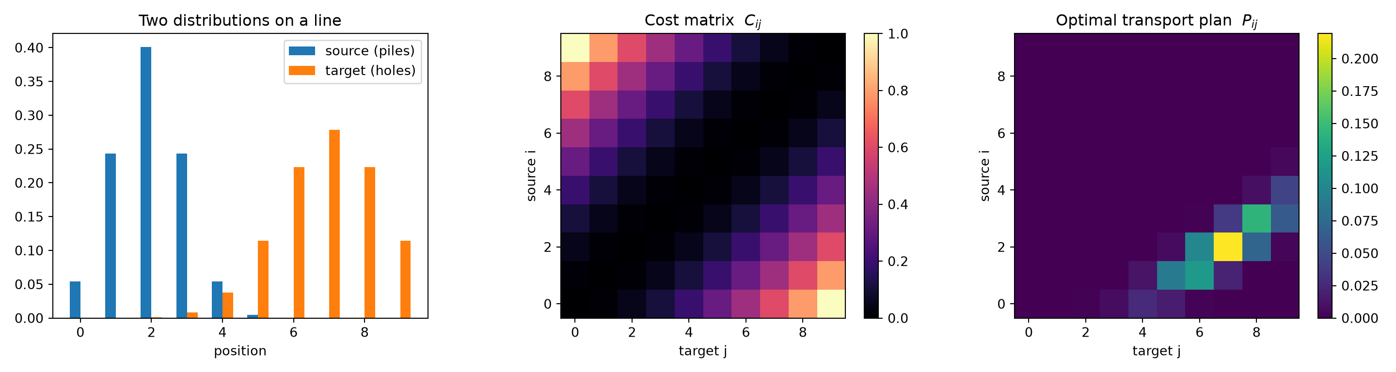
The bright diagonal band in the transport plan tells the story: mass on the left is carried rightward to the nearest available holes, never further than it has to go. That is optimal transport in one line of intuition — move as little as possible, as short a distance as possible.
Why Single Cells Need Optimal Transport
Now for the payoff. Single-cell RNA sequencing measures the gene-expression profile of individual cells — each cell becomes a point in a very high-dimensional space, one axis per gene (we met the perils of that space in the curse of dimensionality). Suppose we want to study a developmental process: stem cells maturing into specialized cell types, say, or a population responding to a drug over several days.
Here is the cruel catch of the technology. Measuring a cell destroys it. To read a cell’s transcriptome we have to break it open. So when we sample the population at day 0 and again at day 4, we are not following the same cells through time — we are looking at two entirely different snapshots, with no labels telling us which day-4 cell descended from which day-0 cell. The correspondence we most want is exactly the thing the experiment cannot give us.
This is precisely a transport problem. We have a distribution of cells at time \(t_0\) and another at time \(t_1\), and we want the most plausible coupling between them. If cells tend to change their expression gradually — a reasonable biological assumption — then the cheapest coupling under a distance cost is a good guess at the true ancestor–descendant relationships. This is the core idea behind Waddington-OT (Schiebinger et al., Cell, 2019), which reconstructs developmental trajectories by chaining optimal-transport plans between consecutive time points.
A Toy Bifurcation
Let us simulate a clean version of this. At \(t_0\) we have a population of progenitor cells, clustered together but with a little spread along one axis of expression. By \(t_1\) the population has bifurcated into two distinct lineages — an upper fate and a lower fate. Because we control the simulation, we know the ground truth; the algorithm does not.
n0 = n1 = 200
half = n1 // 2

# t0: progenitors near x = 0, with spread along the y (fate) axis
X0 = np.column_stack([rng.normal(0, 0.3, n0),
                      rng.normal(0, 1.2, n0)])

# t1: two mature lineages at x ~ 4, separated along y
upper = np.column_stack([rng.normal(4, 0.3, half),
                         rng.normal(2.5, 0.4, half)])
lower = np.column_stack([rng.normal(4, 0.3, n1 - half),
                         rng.normal(-2.5, 0.4, n1 - half)])
X1 = np.vstack([upper, lower])

fate_upper = np.r_[np.ones(half), np.zeros(n1 - half)]   # ground-truth label
fig, ax = plt.subplots(figsize=(7, 6))
ax.scatter(X0[:, 0], X0[:, 1], s=20, alpha=0.6, label="$t_0$ progenitors")
ax.scatter(X1[:, 0], X1[:, 1], s=20, alpha=0.6, label="$t_1$ lineages")
ax.set_xlabel("expression axis 1"); ax.set_ylabel("expression axis 2")
ax.set_title("Two snapshots of a bifurcating population")
ax.legend()
plt.show()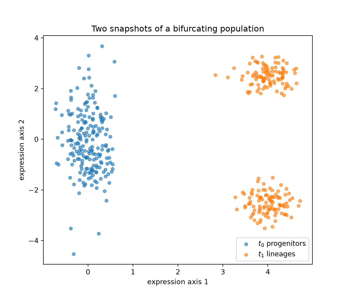
We never observe an arrow from any progenitor to any descendant. All we have are the two clouds. Now we ask optimal transport for the cheapest way to move the \(t_0\) cloud onto the \(t_1\) cloud, using squared distance in expression space as the cost.
C = np.sum((X0[:, None, :] - X1[None, :, :]) ** 2, axis=2)  # pairwise sq. dist.
C = C / C.max()

a = np.full(n0, 1 / n0)
b = np.full(n1, 1 / n1)

P = sinkhorn(a, b, C, reg=0.02)
print("Wasserstein-type cost <P, C>:", round(float((P * C).sum()), 4))
## Wasserstein-type cost <P, C>: 0.2367The plan \(P\) couples ancestors to descendants. We can draw it directly: a faint line from each progenitor to each descendant it sends mass to, with opacity proportional to how much.
fig, ax = plt.subplots(figsize=(7, 6))
thr = P.max() * 0.05
for i in range(n0):
    for j in range(n1):
        if P[i, j] > thr:
            ax.plot([X0[i, 0], X1[j, 0]], [X0[i, 1], X1[j, 1]],
                    color="gray", lw=0.4, alpha=min(1.0, P[i, j] / P.max()))
ax.scatter(X0[:, 0], X0[:, 1], s=15, label="$t_0$")
ax.scatter(X1[:, 0], X1[:, 1], s=15, label="$t_1$")
ax.set_xlabel("expression axis 1"); ax.set_ylabel("expression axis 2")
ax.set_title("The optimal coupling between time points")
ax.legend()
plt.show()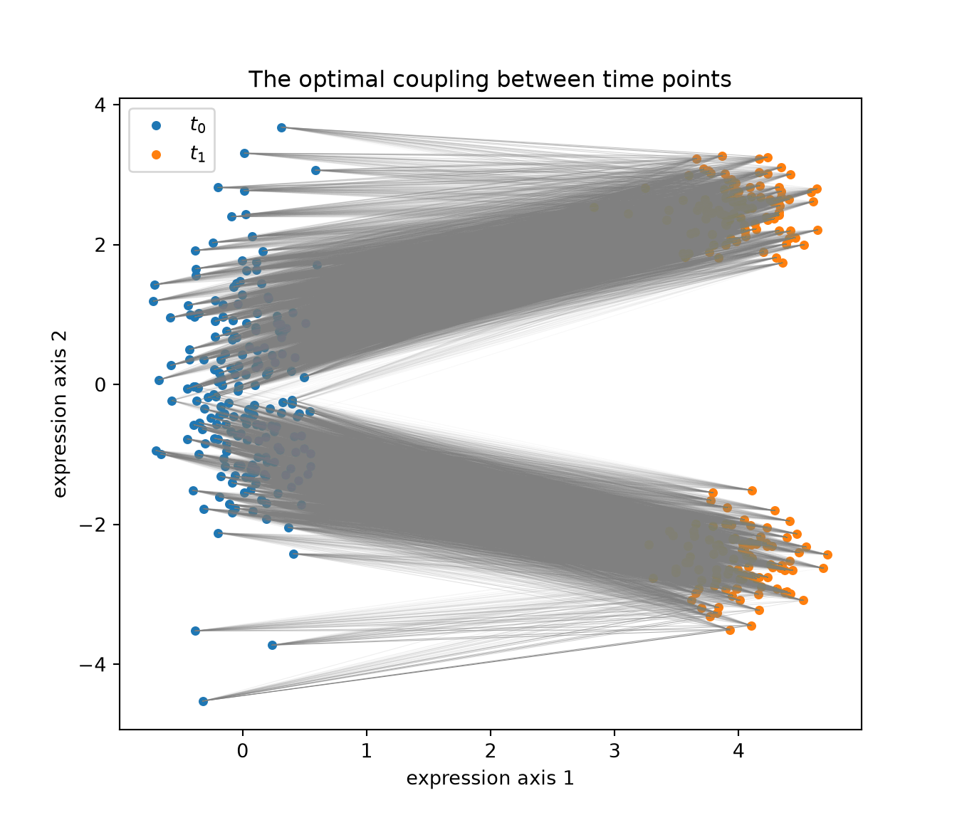
Notice that the plan does not connect progenitors to both lineages indiscriminately. Cells sitting in the upper part of the \(t_0\) cloud send most of their mass upward; cells in the lower part send it downward. The geometry of the early population already encodes a bias toward one fate or the other, and optimal transport reads it out for free.
Predicting Fate Before It Happens
We can make that last observation quantitative. For each progenitor \(i\), the row \(P_{i,\cdot}\) — once normalized — is a probability distribution over its possible descendants. Weighting by the (known) fate labels of the \(t_1\) cells gives each progenitor a predicted probability of becoming an upper-lineage cell:
cond = P / P.sum(axis=1, keepdims=True)   # P(descendant j | ancestor i)
pred_upper = cond @ fate_upper            # expected fate per progenitor

corr = np.corrcoef(X0[:, 1], pred_upper)[0, 1]
print("correlation between early position and predicted fate:", round(corr, 3))
## correlation between early position and predicted fate: 0.855fig, ax = plt.subplots(figsize=(7, 6))
sc = ax.scatter(X0[:, 0], X0[:, 1], c=pred_upper, cmap="coolwarm",
s=30, vmin=0, vmax=1)
fig.colorbar(sc, ax=ax, label="predicted P(upper lineage)")## <matplotlib.colorbar.Colorbar object at 0x7f97fc6f2f10>ax.set_xlabel("expression axis 1"); ax.set_ylabel("expression axis 2")
ax.set_title("Each progenitor coloured by its inferred fate")
plt.show()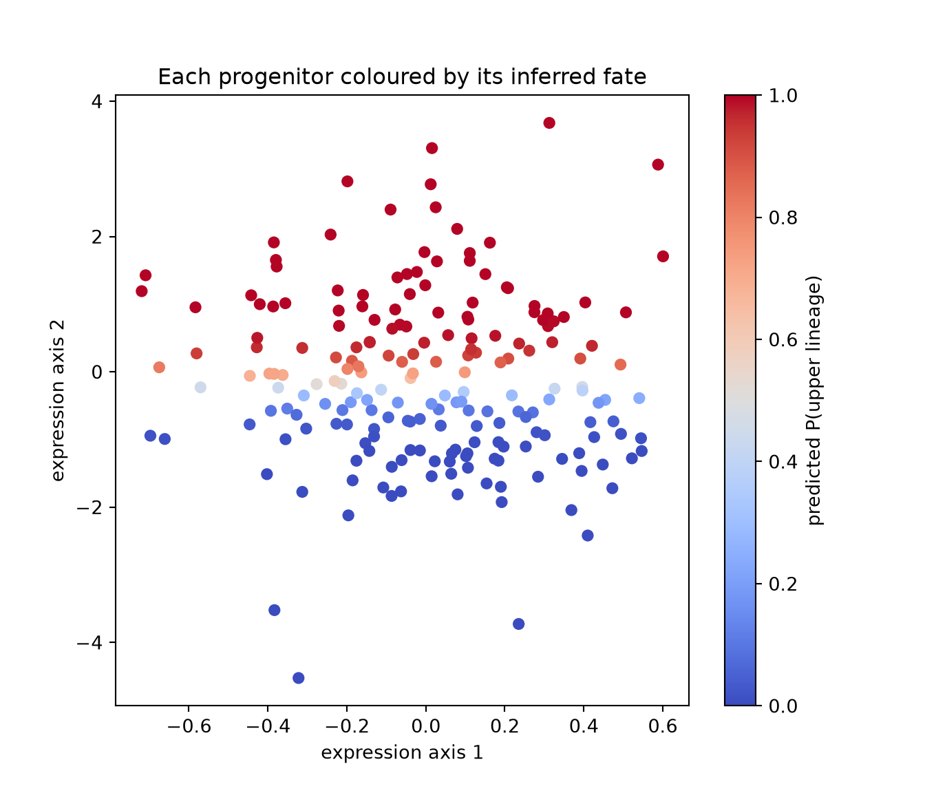
The colour gradient runs cleanly along the fate axis: progenitors near the top are predicted to mature into the upper lineage, those near the bottom into the lower one, and the cells in between are genuinely undecided. We recovered a developmental bias from two unlabeled snapshots, using nothing but geometry and the principle of least effort. No cell was ever tracked; the coupling did the tracking for us.
The Bigger Picture
The bifurcation above is a cartoon, and real applications add important wrinkles — populations grow and die, so the source and target masses do not match (this calls for unbalanced optimal transport), and the cost is usually computed in a reduced space rather than on raw genes. But the skeleton is exactly what we built: define a cost, demand that mass be conserved, and find the cheapest coupling.
The same skeleton shows up well beyond developmental biology:
- Batch integration. Two single-cell datasets from different experiments can be aligned by transporting one onto the other, correcting technical differences while preserving biology.
- Domain adaptation. In machine learning, OT maps a model’s training distribution onto a new test distribution.
- Comparing anything distributional. Word embeddings, image colour palettes, and probability forecasts have all been compared with Wasserstein distance, precisely because it respects the geometry that simpler metrics ignore.
Closing Thought
Optimal transport began with Monge staring at a pile of dirt, asking the most pragmatic question imaginable: what is the least work I can get away with? Two and a half centuries later, the same question lets us watch cells choose their fate without ever following a single one.
I find that lineage genuinely moving. The technique never pretends to know the hidden correspondence it cannot see. It simply assumes that change is costly, that nature is frugal, and that the most plausible story is the one requiring the least rearrangement. From that single, almost philosophical assumption, structure emerges — not because we imposed it, but because the geometry was there all along, waiting for someone to ask how much it would cost to move.
Sometimes the deepest tools are the ones that just refuse to do more work than necessary.