Introduction
In the complex world of data analysis, the ‘curse of dimensionality’ often looms large, presenting unique challenges and opportunities. This blog post delves into the intricacies of this phenomenon, employing the widely-used MNIST dataset to illustrate how dimensionality reduction techniques can unveil patterns and insights hidden in high-dimensional data.
Using the MNIST Dataset
We begin our journey with the MNIST dataset, a simple yet powerful collection of handwritten digits. To make our analysis manageable, we’ll focus on a subset of 5,000 records. Our R environment is set up with essential libraries like tidyverse, keras, and tidymodels, ensuring a smooth analytical process.
keras::use_condaenv("r-keras")
mnist <- keras::dataset_mnist()
mnist_data_original <- mnist$train$x
mnist_label <- as.character(mnist$train$y)[1:n_data_points]

mnist_data <- keras::array_reshape(mnist_data_original,
                                   c(nrow(mnist_data_original), 784))
mnist_data <- mnist_data / 255

# Subset the data taking only the first 10000
mnist_data <- mnist_data[1:n_data_points, 1:ncol(mnist_data)]
Visualizing High-Dimensional Data
Visual representation plays a crucial role in understanding high-dimensional data. Using ggplot, we extract and plot 12 random digits from the MNIST dataset. This visual exploration is our first step in grasping the complexity of the data we’re dealing with.
PCA Analysis: We start with PCA, projecting our data onto a plane defined by the first two principal components. This transformation provides insights into the inherent structure of the data.
UMAP Exploration: Next, UMAP takes us further, offering a nuanced view that respects the manifold structure of the data.
MDS Comparison: Finally, MDS, including both classical and Sammon mapping, gives us another angle to understand our dataset’s underlying geometry.
list_rbind(map(sample.int(n = 2000, size = 12), extract_value)) %>%
  ggplot(aes(x, y, fill = pixel_intensity)) +
  geom_tile() +
  scale_fill_viridis_c(option = "inferno") +
  theme_void() +
  facet_wrap(vars(label), scales = "free")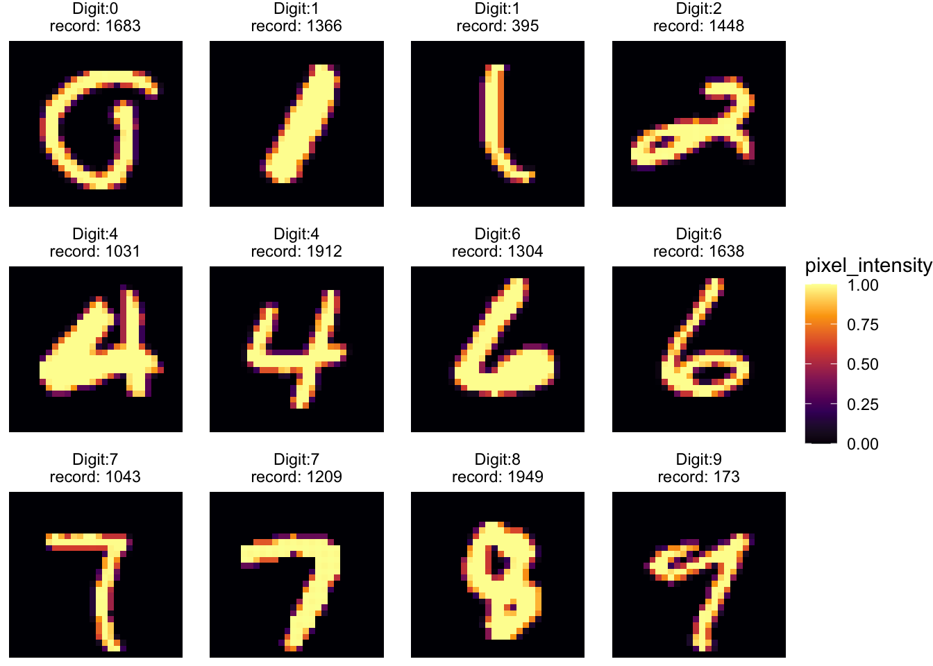
Dimensionality Reduction Techniques
Our main focus lies in the realm of dimensionality reduction. We employ techniques like PCA (Principal Component Analysis), UMAP (Uniform Manifold Approximation and Projection), and MDS (Multidimensional Scaling) to transform our high-dimensional data into a more interpretable form. Each method offers a unique perspective, revealing different aspects of our dataset.
PCA Analysis: We start with PCA, projecting our data onto a plane defined by the first two principal components. This transformation provides insights into the inherent structure of the data.
UMAP Exploration: Next, UMAP takes us further, offering a nuanced view that respects the manifold structure of the data.
MDS Comparison: Finally, MDS, including both classical and Sammon mapping, gives us another angle to understand our dataset’s underlying geometry.
order <- as.character(0:9)
# PCA
mnist_pca <- prcomp(mnist_data, center = TRUE)
mnist_pca_tibble <- broom::augment(mnist_pca) %>%
    select(-.rownames) %>%  rename_all(~str_remove(.x,".fitted")) %>%
    mutate(label = factor(mnist_label, levels = order))


plot_pca <- ggplot(mnist_pca_tibble, aes(PC1, PC2, color = label)) +
  #geom_point(size = 2, alpha = 0.7) +
  geom_text(aes(label = label), size = 7, show.legend = FALSE) +
  ggsci::scale_color_rickandmorty()


# UMAP
mnist_umap <- uwot::umap(X = mnist_data, min_dist = 0.01,
                         learning_rate = 1, metric = "cosine",
                         n_neighbors = 15, n_components = 2, n_epochs = 5000,
                         verbose = FALSE,  n_threads = 8)
mnist_umap_tibble <- as_tibble(mnist_umap) %>%
  rename(UMAP1 = "V1", UMAP2 = "V2" ) %>%
  mutate(label = factor(mnist_label, levels = order)) %>%
  mutate(label_with_order = paste(mnist_label, 1:n()))
## Warning: The `x` argument of `as_tibble.matrix()` must have unique column names if
## `.name_repair` is omitted as of tibble 2.0.0.
## ℹ Using compatibility `.name_repair`.
## This warning is displayed once every 8 hours.
## Call `lifecycle::last_lifecycle_warnings()` to see where this warning was
## generated.plot_umap <- ggplot(mnist_umap_tibble, aes(UMAP1, UMAP2, color = label)) +
geom_text(aes(label = label), size = 7, show.legend = FALSE) +
ggsci::scale_color_rickandmorty()
plot_umap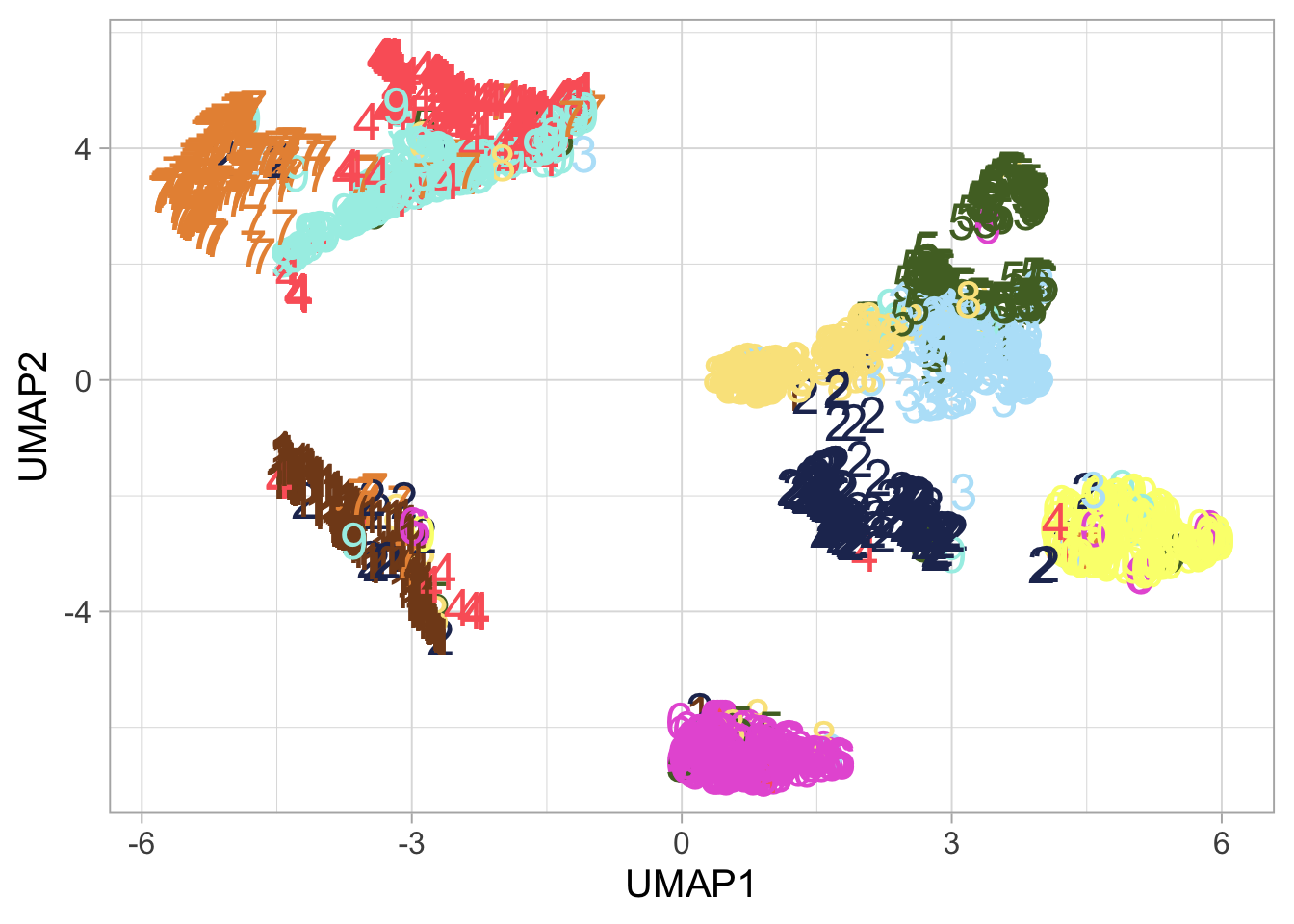
plotly::ggplotly(ggplot(mnist_umap_tibble, aes(UMAP1, UMAP2, color = label, label = label_with_order)) +
  geom_point(size = 7, show.legend = FALSE) +
  ggsci::scale_color_rickandmorty() )
# MDS
mnist_data_distance <-
Rfast::Dist(mnist_data, vector = FALSE, method = "cosine")
mds_iso <- as_tibble(MASS::isoMDS(mnist_data_distance)$points) %>%
rename(MDS1 = "V1", MDS2 = "V2" ) %>%
mutate(label = factor(mnist_label, levels = order)) ## initial value 94.241384
## iter 5 value 41.880914
## final value 41.603447
## convergedmds_sammon <- as_tibble(MASS::sammon(mnist_data_distance)$points) %>%
rename(MDS1 = "V1", MDS2 = "V2" ) %>%
mutate(label = factor(mnist_label, levels = order)) ## Initial stress : 0.95732
## stress after 10 iters: 0.88240, magic = 0.004
## stress after 20 iters: 0.81549, magic = 0.002
## stress after 30 iters: 0.73965, magic = 0.004
## stress after 40 iters: 0.67963, magic = 0.045
## stress after 50 iters: 0.58810, magic = 0.021
## stress after 53 iters: 0.57670ggplot(mds_sammon, aes(MDS1, MDS2, color = label)) +
geom_point(size = 2, alpha = 0.7) + ggsci::scale_color_rickandmorty() 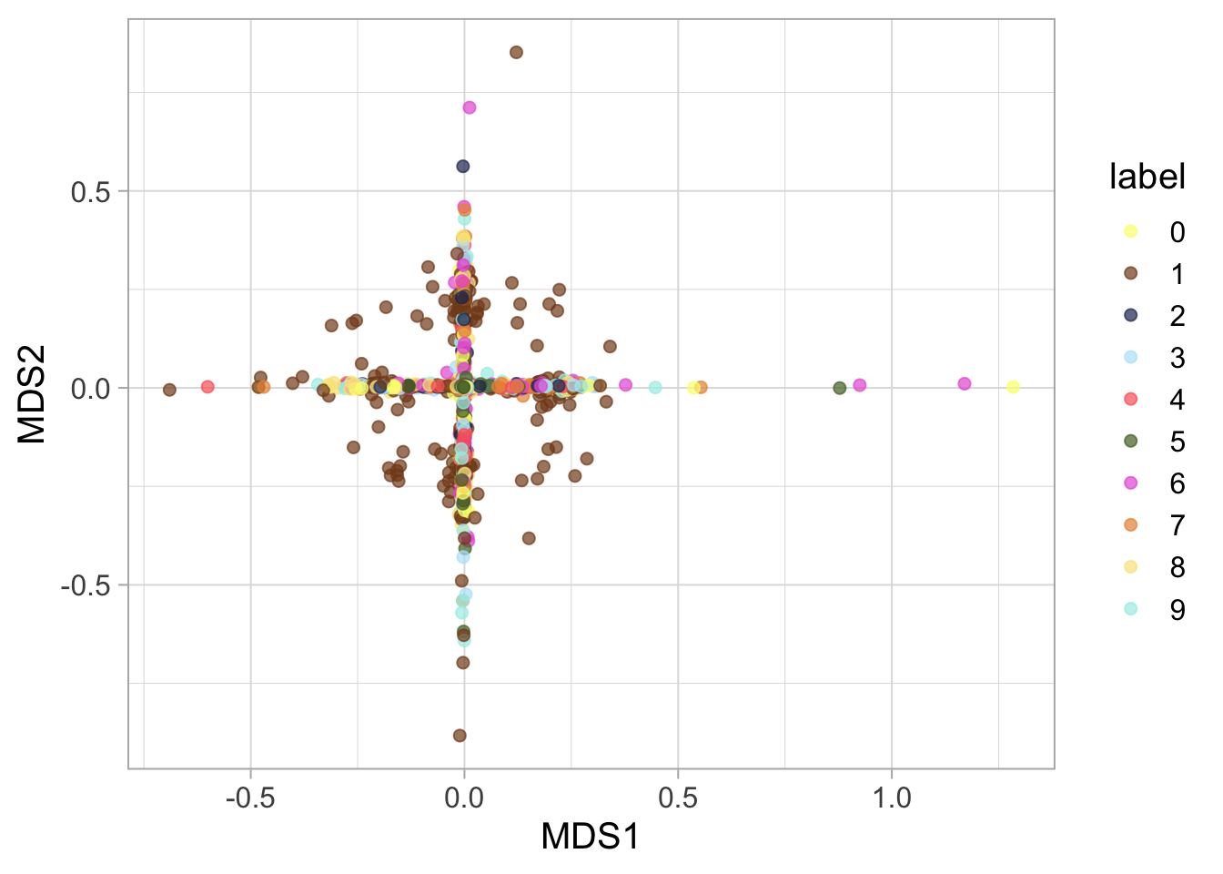
patchwork::wrap_plots(plot_pca, plot_umap) +
  patchwork::plot_layout(guides = 'collect')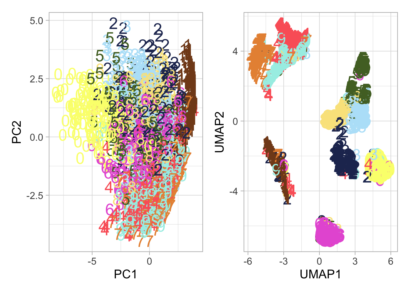
The Curse of Dimensionality
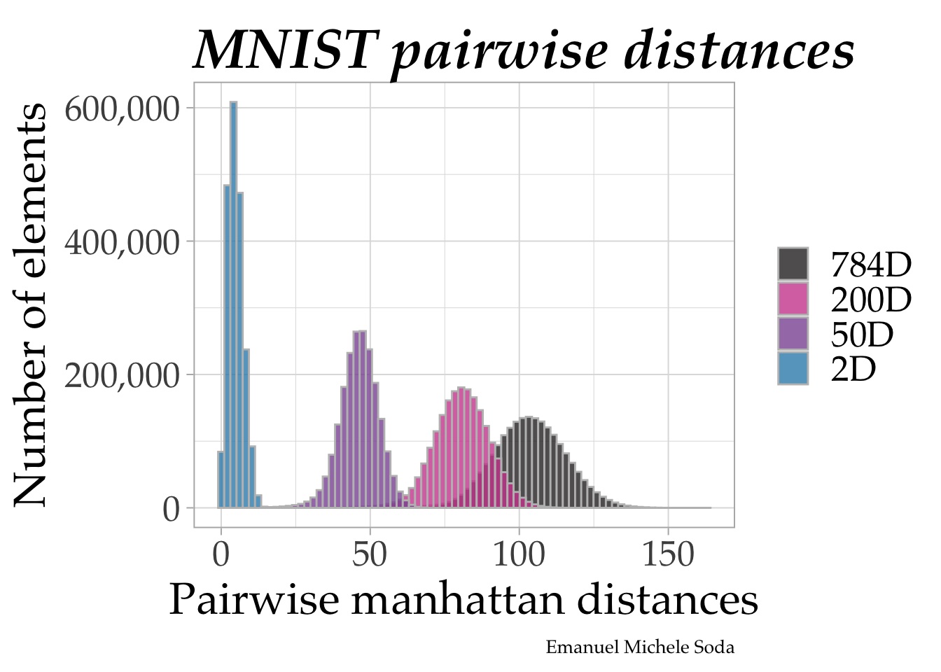
We then dive deeper into the ‘curse of dimensionality.’ Here, we compare pairwise distances within our dataset across different dimensional spaces – 784D, 200D, 50D, and 2D. This comparison vividly illustrates how dimensionality influences the perception and analysis of data.
# PCA
method <- "manhattan"
mnist_pca <- prcomp(mnist_data, center = TRUE)
mnist_pca <- broom::augment(mnist_pca) %>%
    select(-.rownames) %>%  rename_all(~str_remove(.x,".fitted")) %>%
    as.data.frame() %>%  as.matrix()

mnist_pca_distance <-
    Rfast::Dist(mnist_pca, vector = FALSE, method = method)
mnist_data_distance_pca784 <-
    mnist_pca_distance[lower.tri(mnist_pca_distance, diag = FALSE)]
mnist_data_distance_pca784 <- tibble(distances = mnist_data_distance_pca784)

mnist_pca_distance <-
    Rfast::Dist(mnist_pca[, 1:50], vector = FALSE, method = method)
mnist_data_distance_pca50 <-
    mnist_pca_distance[lower.tri(mnist_pca_distance, diag = FALSE)]
mnist_data_distance_pca50 <- tibble(distances = mnist_data_distance_pca50)

mnist_pca_distance <-
    Rfast::Dist(mnist_pca[, 1:200], vector = FALSE, method = method)
mnist_data_distance_pca200 <-
    mnist_pca_distance[lower.tri(mnist_pca_distance, diag = FALSE)]
mnist_data_distance_pca200 <- tibble(distances = mnist_data_distance_pca200)

mnist_pca_distance <-
    Rfast::Dist(mnist_pca[, 1:2], vector = FALSE, method = method)
mnist_data_distance_pca2 <-
    mnist_pca_distance[lower.tri(mnist_pca_distance, diag = FALSE)]
mnist_data_distance_pca2 <- tibble(distances = mnist_data_distance_pca2)


mnist_distances <-
    mnist_data_distance_pca784 %>%
    mutate(space = "784D") %>%
    bind_rows(mnist_data_distance_pca200 %>%
                  mutate(space = "200D")) %>%
    bind_rows(mnist_data_distance_pca50 %>%
                  mutate(space = "50D")) %>%
    bind_rows(mnist_data_distance_pca2 %>%
                  mutate(space = "2D"))  %>%
  mutate(space = fct_inorder(space))


mnist_distances %>%
  ggplot(aes(distances, fill = space)) +
  geom_histogram(bins = 80, position= position_identity(), color = "grey",
                 alpha = 0.8) +
  labs(x = paste0("Pairwise ", method, " distances"),
       y = "Number of elements",
       title = "MNIST pairwise distances", fill = NULL,
       caption = "Emanuel Michele Soda")  +
  scale_y_continuous(labels = scales::comma) +
  ggsci::scale_fill_cosmic()  +
  theme(
    text = element_text(family = "Palatino", size = 24),
    plot.title = element_text(size = 30, vjust = 0, face = "bold.italic"),
    plot.caption = element_text(size = 10)
    )
compute the distance
mnist_data_distance <-
    Rfast::Dist(mnist_data, vector = FALSE, method = "euclidean")


mnist_data_distance <- mnist_data_distance[lower.tri(mnist_data_distance, diag = FALSE)]
mnist_data_distance <- tibble(distances = mnist_data_distance)

mnist_data_distance %>%
    ggplot(aes(distances)) +
    geom_histogram(bins = 100, fill = "steelblue") +
    labs(x = paste0("Pairwise euclidean distances in ", ncol(mnist_data),
" dimensions")) 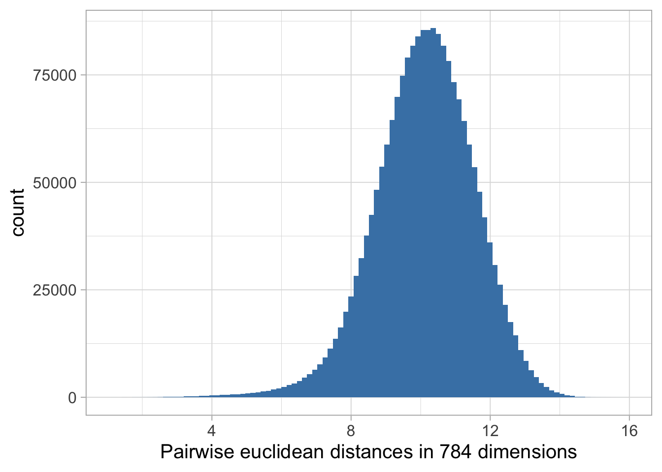
UMAP Clustering Examples
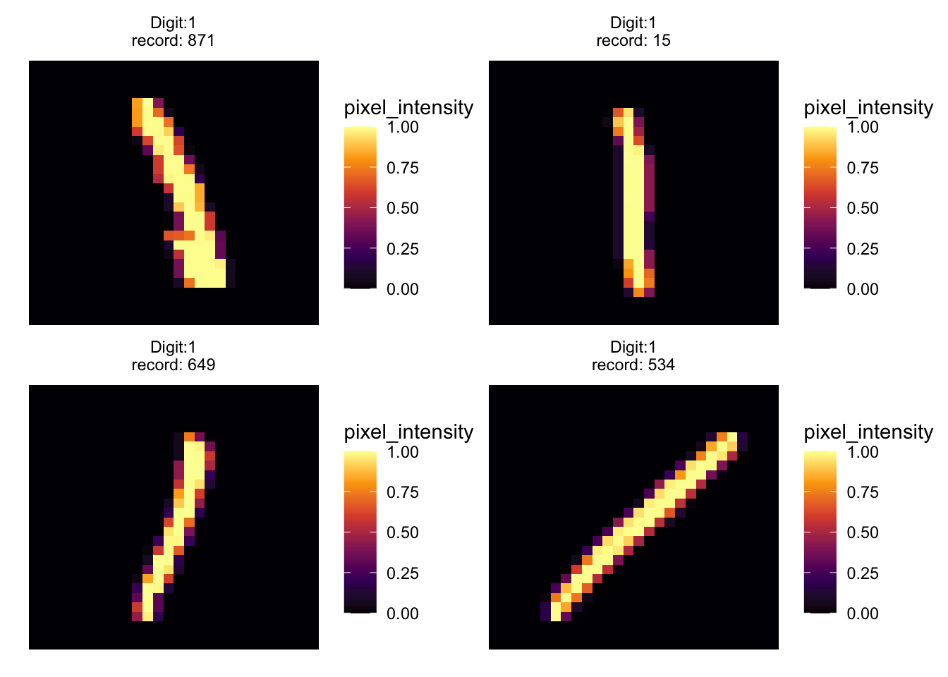
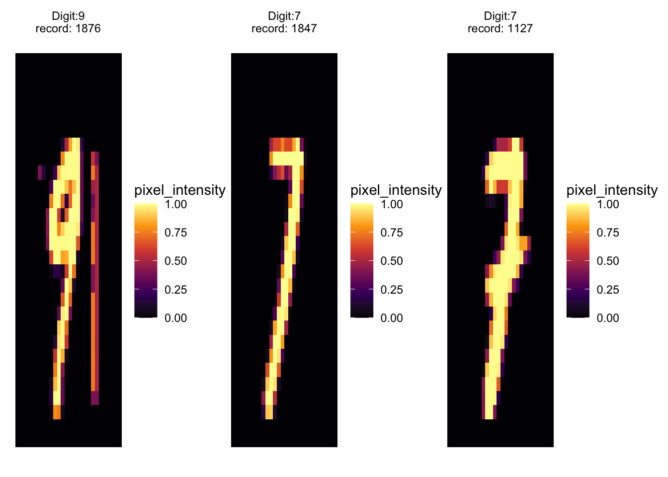
To bring our exploration to a close, we examine specific examples of numbers obtained using UMAP clustering. This section highlights how different representations of the digit ‘one’ cluster together, providing a tangible example of UMAP’s power in grouping similar data points.
# mmoving from left too right we have tilted ones
patchwork::wrap_plots(
    purrr::map(.x = c(871, 15, 649, 534),
        .f =  ~ extract_value(.x) %>%
              ggplot(aes(x, y, fill = pixel_intensity)) +
        geom_tile() +
        scale_fill_viridis_c(option = "inferno",) +
        theme_void() +
        facet_wrap(vars(label), scales = "free")
        )
    )
patchwork::wrap_plots(
purrr::map(.x = c(1876, 1847, 1127),
.f = ~ extract_value(.x) %>%
ggplot(aes(x, y, fill = pixel_intensity)) +
geom_tile() +
scale_fill_viridis_c(option = "inferno") +
theme_void() +
facet_wrap(vars(label), scales = "free")
)
) # Conclusion
The journey through high-dimensional spaces is fraught with challenges, but as we’ve seen, techniques like PCA, UMAP, and MDS offer powerful tools to navigate this complexity. By reducing dimensions thoughtfully, we can uncover patterns and insights that would otherwise remain hidden in the sheer scale of data.